by Alex Kim, Consultant at Practicum by Yandex
Twitter | LinkedIn
Note: This is Part 3 of a three-part article. If you haven't read Part 1 and Part 2, we recommend that you do so first.
Quick data exploration
In Part 1, we loaded our LendingClub data; in Part 2, we performed preprocessing. Now our dataset is clean and ready for exploration.
What exactly happens at this stage depends on the business problem you're dealing with. It typically involves things like data visualization, statistical analysis, and machine learning modeling.
Let's see how we'd further explore one of the columns in our DataFrame, 'home_ownership'. First, we'll see how many missing values are in this column, if any (again, by chaining together the pandas.Series.isna() and pandas.Series.sum() methods).
Then, we'll get only the list of unique values in this column (pandas.Series.unique()) and their counts (pandas.Series.value_counts()).
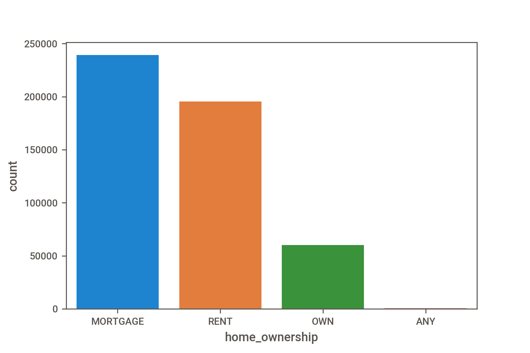
Histogram plots are an excellent choice to visualize value counts. Here we are using the seaborn data visualization library.
We pass an optional order= parameter to the seaborn.countplot() method to order our histogram from the largest to smallest category.

The issue is that when we have many columns, as we do in this case, performing these steps will become very tedious very quickly.
Fortunately, a lot of data exploration can be automated. This reduces the amount of boilerplate code that you'd need to write to compute common statistics and relationships between variables. Below, we'll show you how to use two different libraries for automating exploration.
The pandas-profiling library
Using this library involves three steps:
- Import the ProfileReport class from the library.
- Instantiate a ProfileReport object with optional parameters. Here, we'll be running the analysis in minimal mode, which disables resource-intensive computations.
- Display the resulting report as HTML embedded in a Jupyter notebook, ipywidgets, or in a separate HTML file.
.png)
The sweetviz library
Another way to get an interactive and automated data visualization report is to use sweetviz.
- Create a report by passing the DataFrame to the sweetviz.analyze() method. We set the pairwise_analysis= parameter to "off" to disable expensive computations.
- Call the show_notebook() method to display the interactive report inside the notebook.
.png)
There are other libraries that perform automated exploratory data analysis. Which one you choose is largely a matter of taste.
Summary
Everything we've described in this 3-part article can be viewed in this Jupyter notebook.
While data cleaning may not be the most exciting process, it’s arguably one of the most crucial steps for extracting valuable insights from your data. What you do at this stage will affect what business decisions are made down the line.
Approach this with care: document your choices and assumptions, making them explicit to others and yourself. Ask questions like:
- Are these dates really in the time zone I think they are?
- Are these observations really outliers? If so, is there an issue with how the data is being recorded in the database?
- Do zeros replace missing values in my data?
For an exhaustive guide to common data issues, we encourage you to check out the Quartz guide to bad data.
It might be a good idea to keep notes of all the unexpected and interesting things you observe. In a work setting, you can review these notes with someone who has in-depth knowledge of the data to see which direction you should go next.
What's next?
If you'd like to continue working with this dataset by creating some data visualizations, we can recommend the following libraries for you to try out:
- For static plots: seaborn or ggplot
- For interactive plots: plotly-express or bokeh
Learn more about the data science bootcamp and other courses by visiting Practicum and signing up for your free introductory class.


.jpg)


.jpg)